
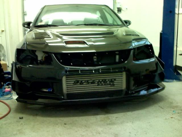
buschur racing fmic stencil overlay


 Apr 11, 2008, 11:50 AM
#6
Evolving Member
iTrader: (1)
Join Date: May 2007
Location: NOVA
Posts: 468
Likes: 0
Received 0 Likes
on
0 Posts
IMO it would look better if the logo was symmetrical (spellimg?) for the FMIC. The word racing should be centered. I only say that because its going in the MIDDLE of the front bumper where symmetry is important and an offset logo doesn't look right to me.
Last edited by E\/0IXG$R; Apr 11, 2008 at 11:52 AM.
Trending Topics
Apr 11, 2008, 01:09 PM
#9
Evolving Member
iTrader: (3)

Join Date: Aug 2007
Location: Miami, FL
Posts: 213
Likes: 0
Received 0 Likes
on
0 Posts
the racing should be in the exact middle of BUSCHUR... it just doesnt look too right....and everything should maybe be a little bigger as you cant read from far...


