Notices
Evo X Show / Shine Post your pictures, photoshops, and videos!

WW Evo X re-Badged hotness.

Thread Tools
 
Search this Thread
 
Old Feb 16, 2008 | 12:19 PM
  #31  
chrsevx's Avatar
Account Disabled
iTrader: (1)
 
Joined: Sep 2007
Posts: 216
Likes: 0
From: Anywhere I want.
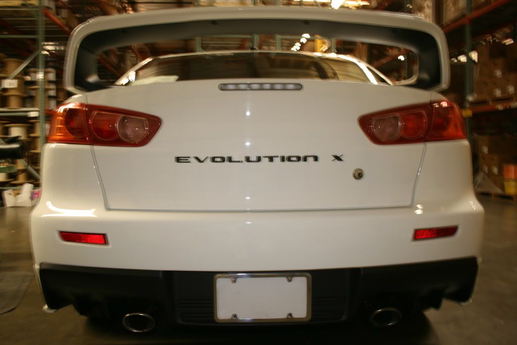
Do yourself a favor and take off that wing it makes the rear end look worse than it already is. Theirs a video on youtube where a spoon type r sedan mugen is versing a evo x in white without a wing when you see that evo x without the wing you already know it looks better without the wing. Here is the vid http://youtube.com/watch?v=ZhIHn3rOn8c

Last edited by chrsevx; Feb 16, 2008 at 12:46 PM.
Old Feb 16, 2008 | 01:24 PM
  #32  
DirectorSe7en's Avatar
Account Disabled
iTrader: (12)
 
Joined: Oct 2007
Posts: 2,335
Likes: 0
From: New Jersey
lol, +1
Old Feb 16, 2008 | 03:29 PM
  #33  
GGEVO253's Avatar
Thread Starter
Newbie
iTrader: (1)
 
Joined: Sep 2006
Posts: 55
Likes: 0
From: KENT TOWN WA
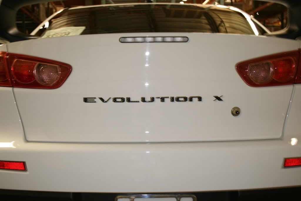
Here are the strt on shots.


Old Feb 16, 2008 | 03:31 PM
  #34  
nemosEVO's Avatar
Evolving Member
iTrader: (10)
 
Joined: Jan 2008
Posts: 145
Likes: 0
From: Phoenix
That looks really good.... 2 thumbs up.
Old Feb 16, 2008 | 04:16 PM
  #35  
cksdayoff's Avatar
Evolving Member
 
Joined: Jun 2007
Posts: 393
Likes: 0
From: pa
the design of the decal blends in perfectly with the rear. it looks really really good.

i wonder how it would look with the mitsu badge above it.
Old Feb 16, 2008 | 11:46 PM
  #36  
badboybr09's Avatar
Evolving Member
iTrader: (2)
 
Joined: Mar 2006
Posts: 367
Likes: 0
From: Danbury,CT
i would move it up a little bit
Old Feb 18, 2008 | 03:37 PM
  #37  
ExcessLancer's Avatar
Evolved Member
 
Joined: May 2005
Posts: 1,259
Likes: 0
From: ATLANTA
Nice but the "x" is too far from the "n"
Old Feb 20, 2008 | 10:53 PM
  #38  
Evo IX MR's Avatar
Evolved Member
 
Joined: Jul 2006
Posts: 705
Likes: 0
From: California
I know its already been said but it should be above the trunk line. Its way too close to the key hole. But if you do put it above the line its going to look too close to the tail-lights. So basically its a lose lose situation. Nice badge though.
Old Feb 20, 2008 | 10:54 PM
  #39  
Evo IX MR's Avatar
Evolved Member
 
Joined: Jul 2006
Posts: 705
Likes: 0
From: California
Originally Posted by ExcessLancer
Nice but the "x" is too far from the "n"
That too.
Old Feb 21, 2008 | 12:08 PM
  #40  
bosox28's Avatar
Evolving Member
iTrader: (1)
 
Joined: Jul 2007
Posts: 273
Likes: 0
From: Glastonbury, CT / Boston, MA
Originally Posted by Evo IX MR
I know its already been said but it should be above the trunk line. Its way too close to the key hole. But if you do put it above the line its going to look too close to the tail-lights. So basically its a lose lose situation. Nice badge though.
I agree, it looks odd there because of the key hole.
Old Feb 21, 2008 | 01:45 PM
  #41  
TearItUpSports's Avatar
Evolved Member
iTrader: (2)
 
Joined: Oct 2001
Posts: 713
Likes: 0
From: Houston, TX (NW)
Better?

Attached Thumbnails WW Evo X re-Badged hotness.-evostrt.jpg  
Old Feb 21, 2008 | 02:24 PM
  #42  
Turbolover's Avatar
Evolved Member
iTrader: (5)
 
Joined: Aug 2003
Posts: 1,209
Likes: 0
From: Phx,AZ
It looks out of place. I say no badges at all.
Old Feb 21, 2008 | 02:46 PM
  #43  
evo_soul's Avatar
Former Sponsor
 
Joined: Jul 2007
Posts: 2,362
Likes: 1
From: the land between lancer and evo
Proper thats what Mitsu should have done
Old Feb 21, 2008 | 02:48 PM
  #44  
Billy@EnglishRacing's Avatar
Former Sponsor
iTrader: (18)
 
Joined: Jul 2006
Posts: 5,458
Likes: 0
From: Puyallup, wa
looks better with no badging imo
Old Feb 21, 2008 | 04:07 PM
  #45  
ExcessLancer's Avatar
Evolved Member
 
Joined: May 2005
Posts: 1,259
Likes: 0
From: ATLANTA
hmmmmm...?!


Quick Reply: WW Evo X re-Badged hotness.


All times are GMT -7. The time now is 08:22 PM.